un.formal
>>Thesis
>>Branding
>>Transmedia
2022
Mentor:
Constantin Chopin
Brad Bartlett
Mazzie Miles
Mentor:
Constantin Chopin
Brad Bartlett
Mazzie Miles
“Typography is what language looks like.”
Typography and letterforms are not only vessels for meaning but also for emotions. A typographic aesthetics shaped by a single race and gender would keep the minorities from being themselves directly.
The purpose of this brand is to diversify graphic design from the basic of it—typography.
The industry, and our aesthetics are dominated by a single race and a single gender. By using the online tool, people could “talk” through their emotion to typography; the installation is another touch point as educational tool with the short history of typography.
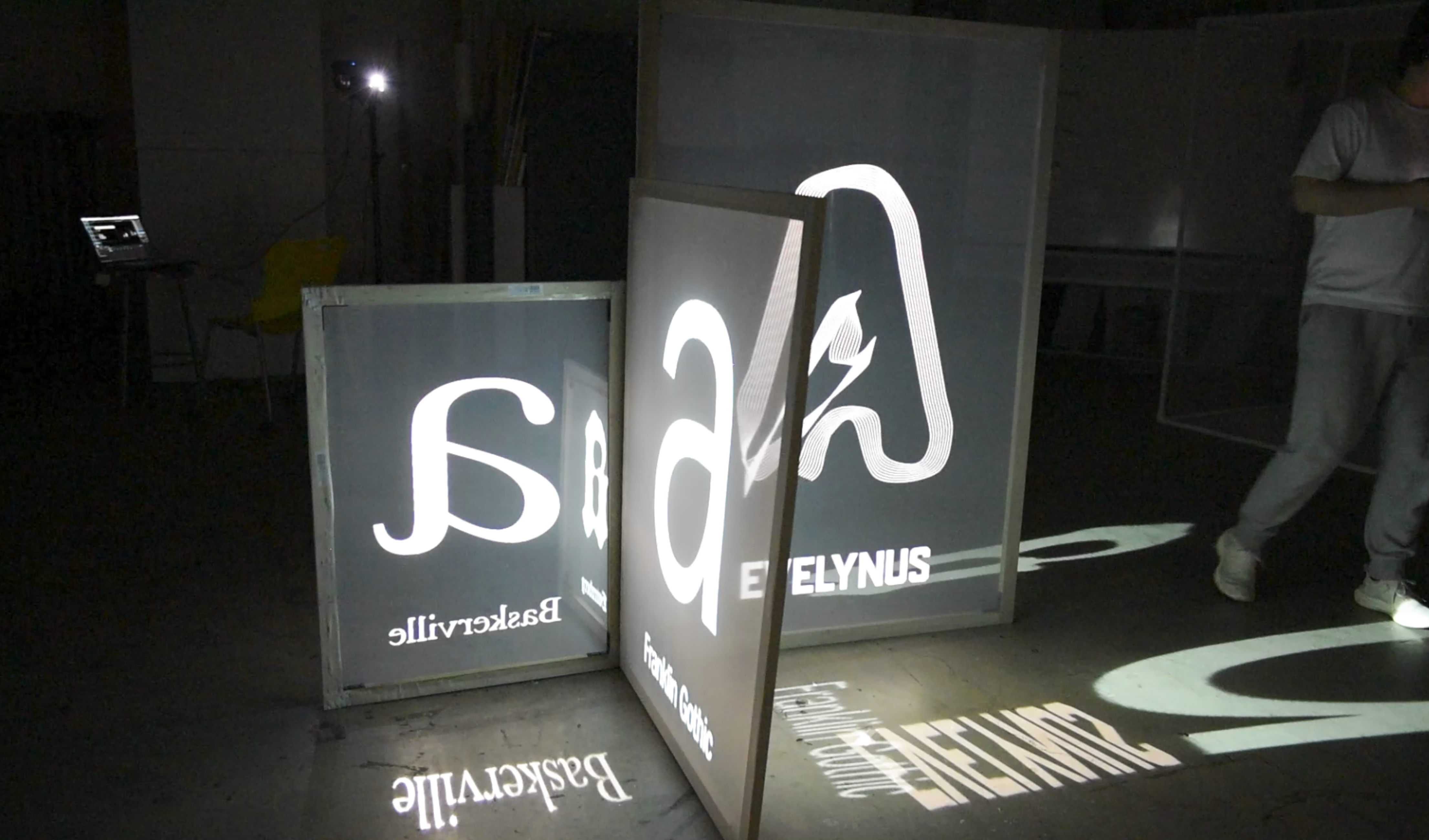
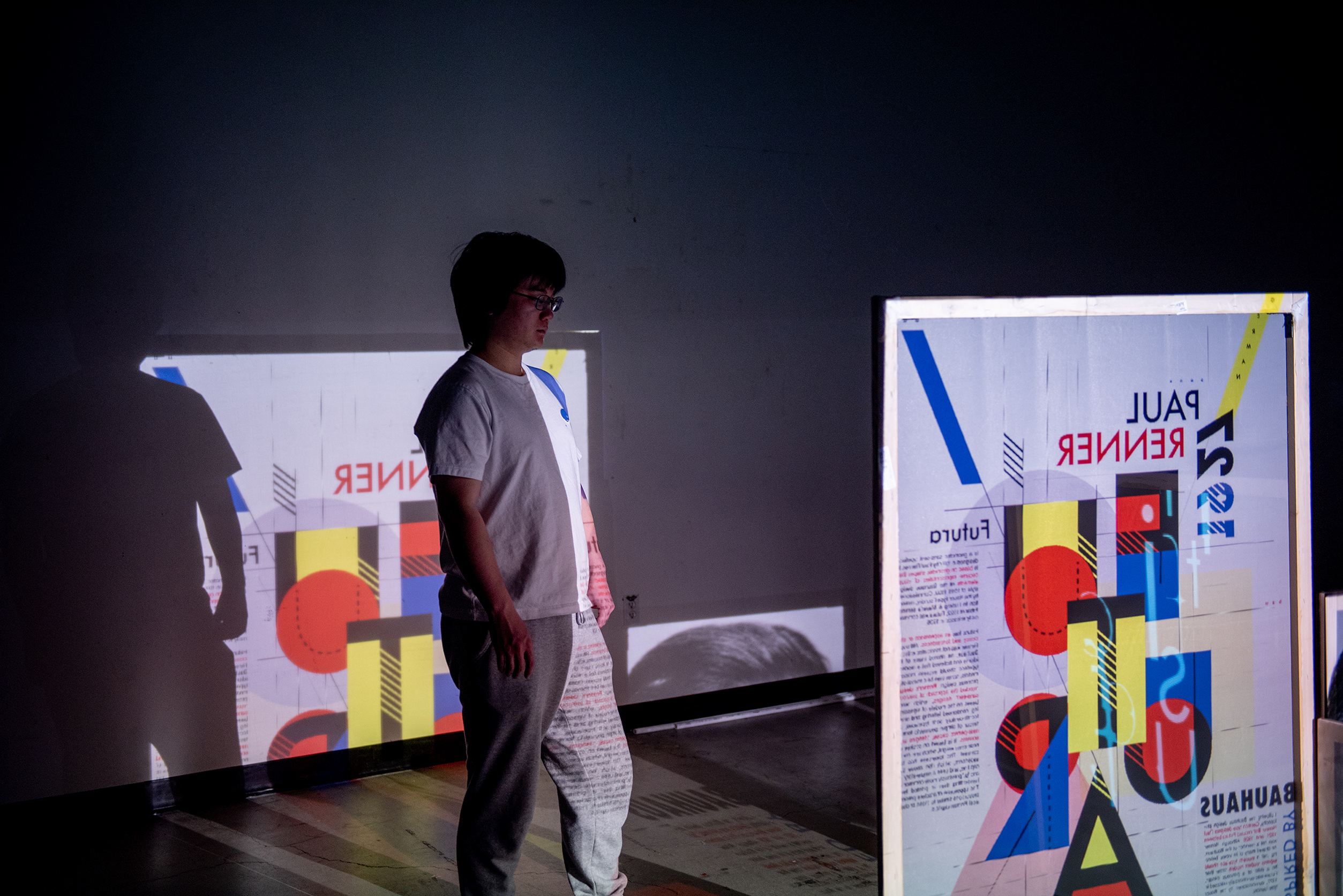
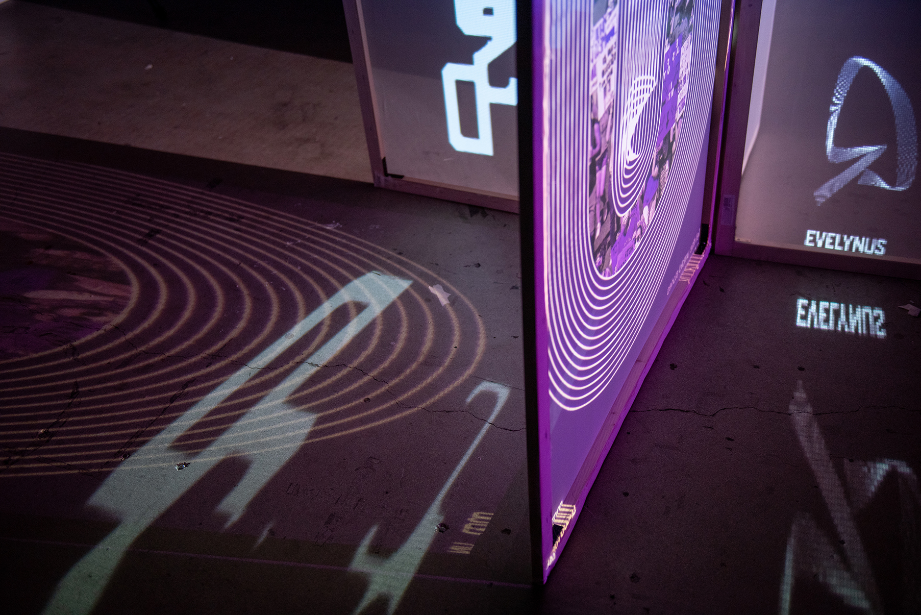
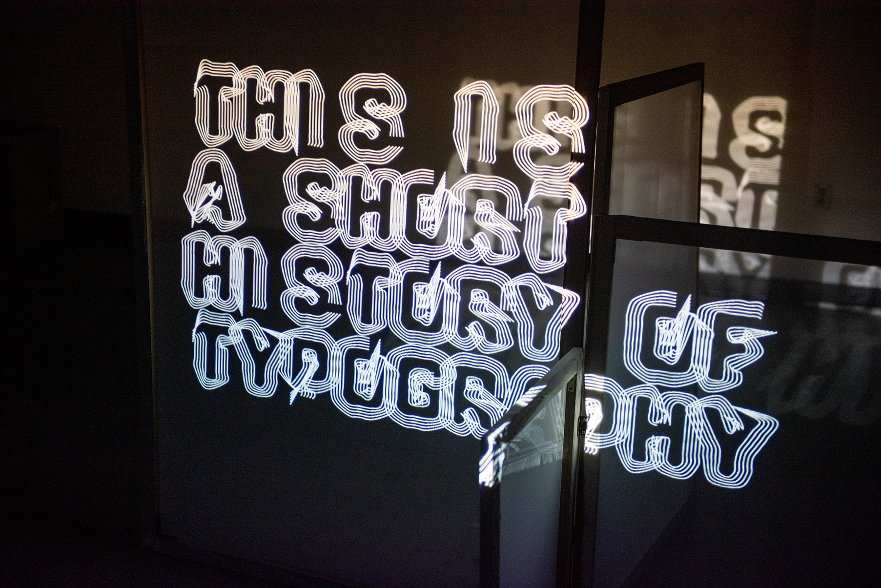
︎ Installation
The installation of projection mapping is the main educational touch point of the brand. It is where everyone can learn something new about the typefaces, and type history.
The installation of projection mapping is the main educational touch point of the brand. It is where everyone can learn something new about the typefaces, and type history.
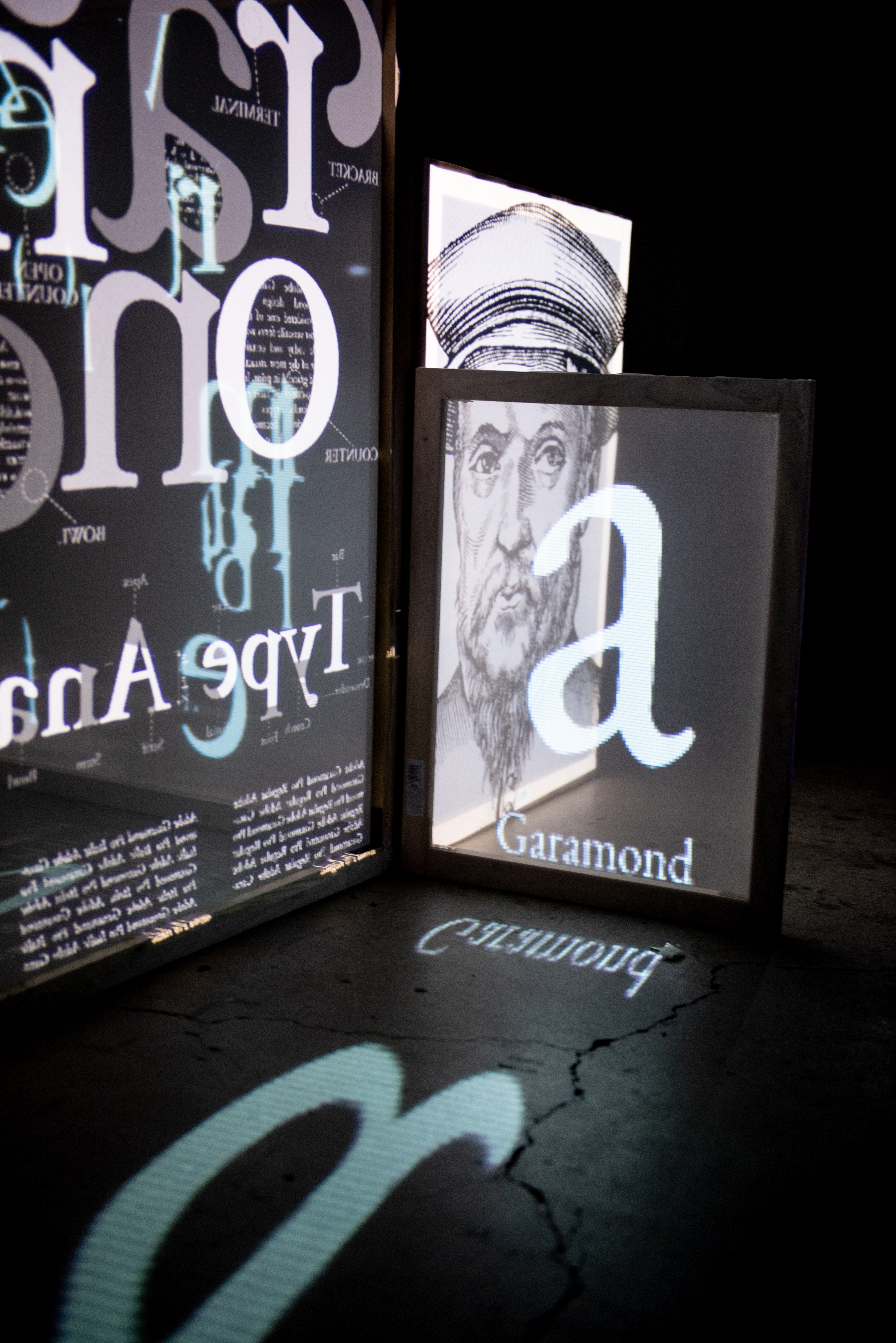
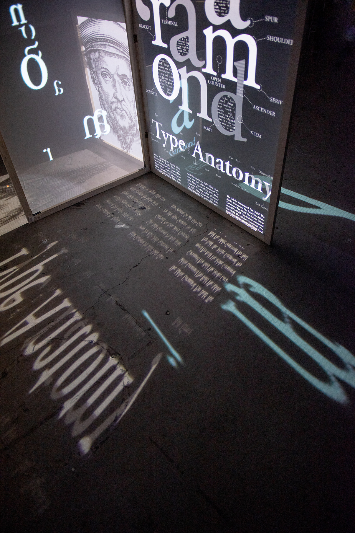
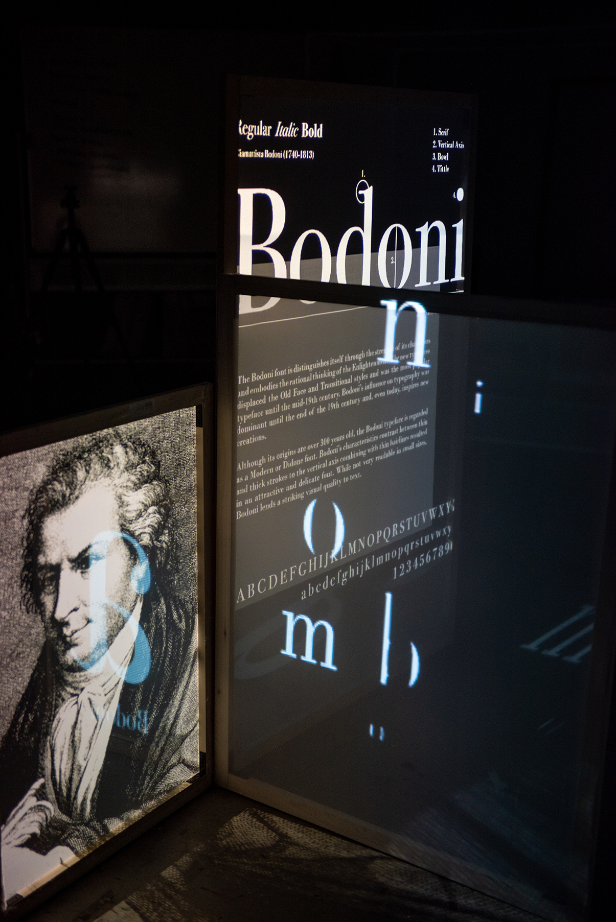
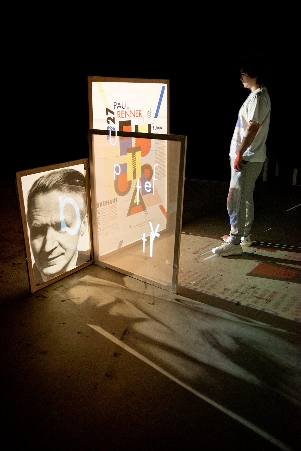
There is 4 transparent panels, indicates 4 different time period in the typography design history:
- 15-17th century, metal type, black type, Centaur, Garamond
-
18-19th century, Sketches, Baskerville, Bodoni, Rockwell
-
20th century, Digitizing, Franklin Gothic, Helvetica, Futura
- 21th century, showing coding, demostration of generative design
The frames are covered by the transparent fabric. The light project onto the surface, not only create images on the frame, but also leave the shadows and lights on the floor and wall. While people interact with the installation, the images and type will change to another time period.
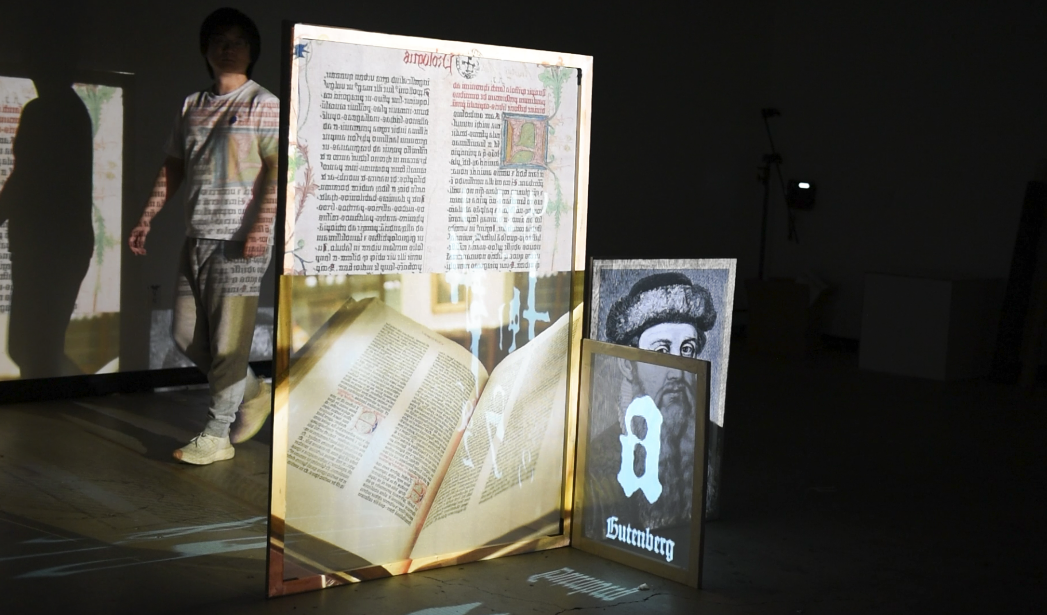


The second scene is showing font design process in different time perioud. The tranditional way of font design is from ideation, research, sketch, to the production of metal or wood type, using anchor points to digital typefaces, and the most recent interactive type design way — creative coding applied to font design.
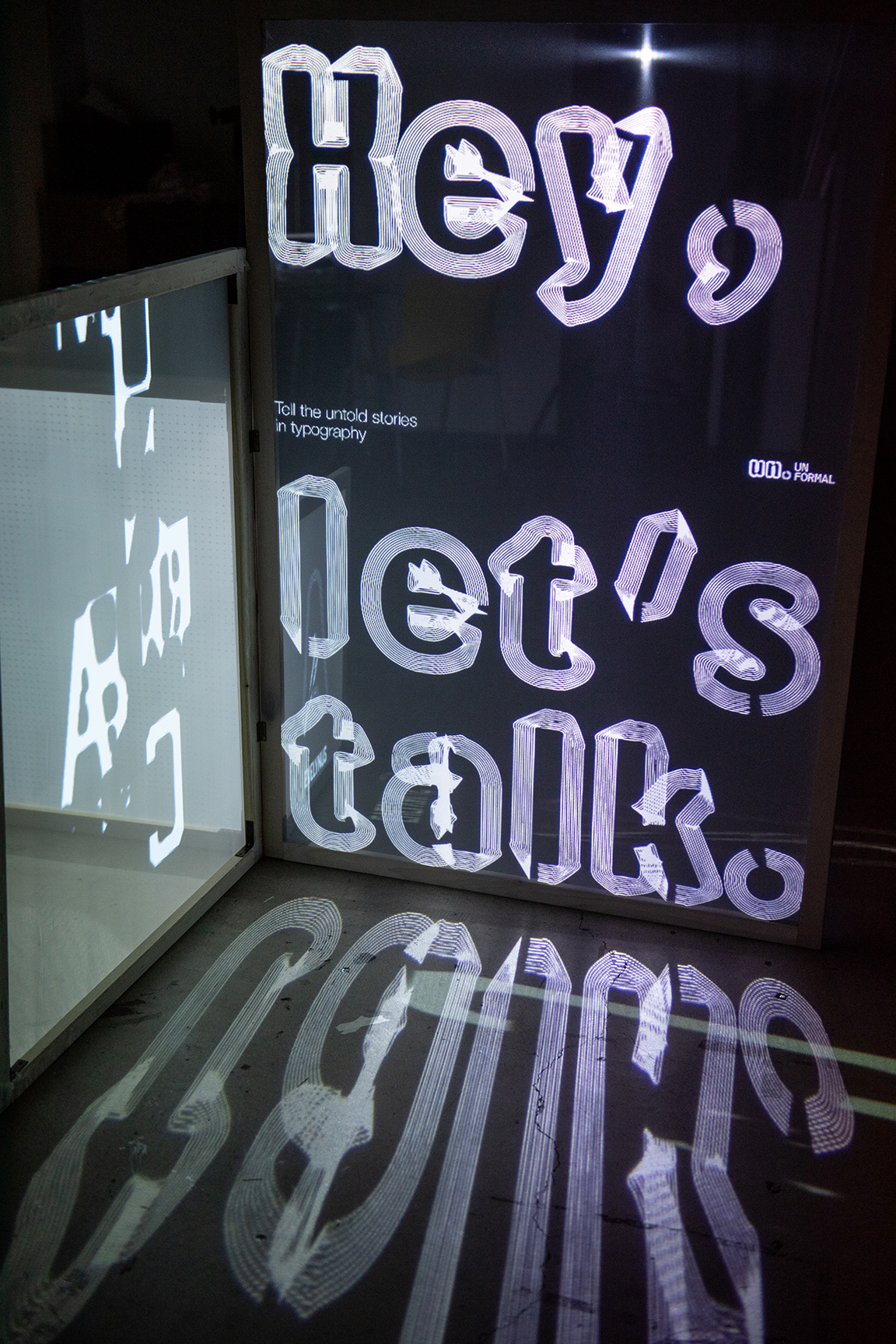
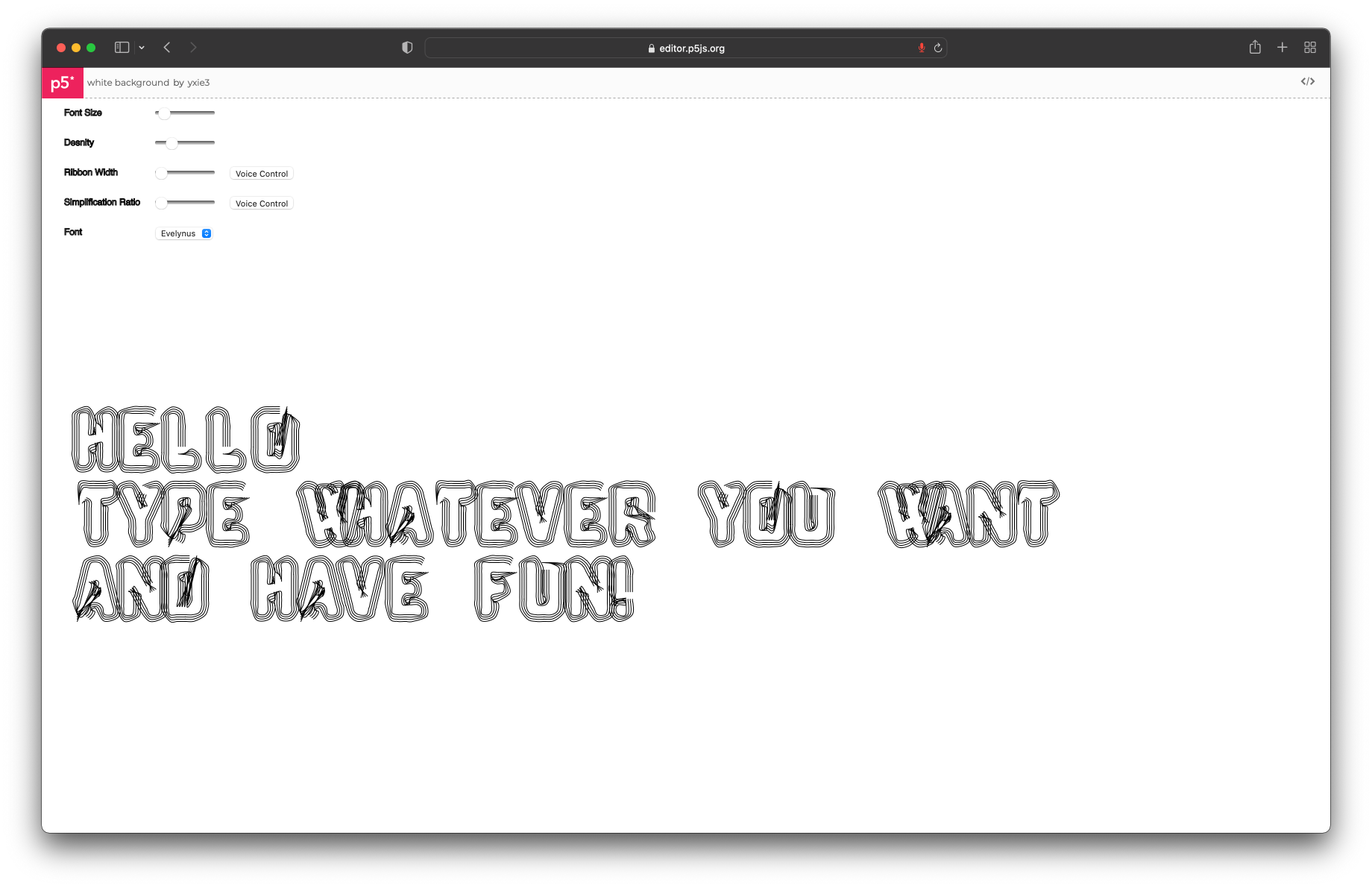
︎ Website
The website is the platform allow people to interact, talk, and play with the creative coding, express themselves through the typography. Users can download the images, and post them on their own social media.
>Check out the real-time type tool
The website is the platform allow people to interact, talk, and play with the creative coding, express themselves through the typography. Users can download the images, and post them on their own social media.
>Check out the real-time type tool

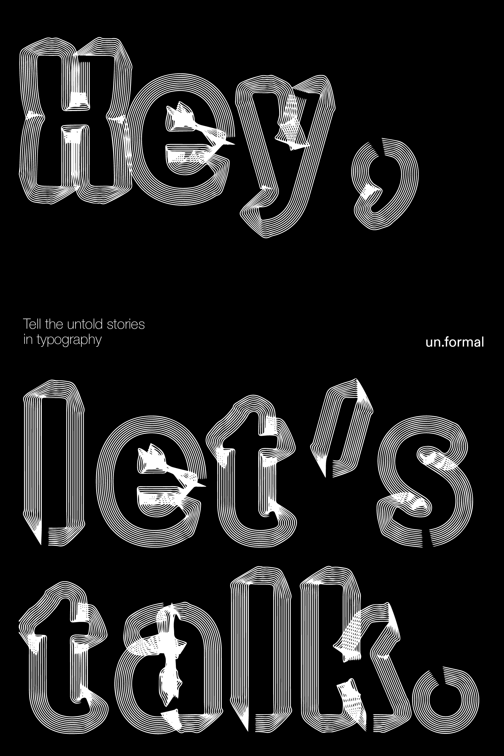
︎ Posters
Why Posters?
Althogh un.formal brand is completely reliant on interactive creative coding via online platform, posters are typically a rote means of communication, these posters are meant to be plastered around outside spaces, as a promotional piece of the website and exhibition.
![]()
Why Posters?
Althogh un.formal brand is completely reliant on interactive creative coding via online platform, posters are typically a rote means of communication, these posters are meant to be plastered around outside spaces, as a promotional piece of the website and exhibition.


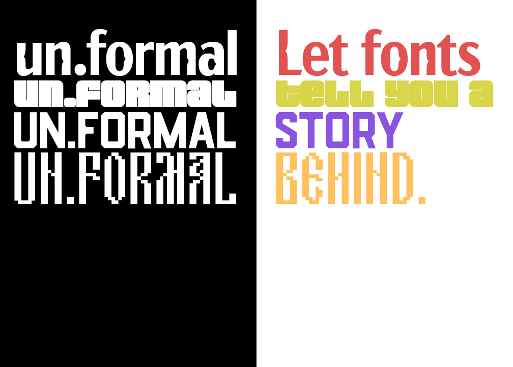
︎ Typography
Fonts specially designed for online creative code type tool.
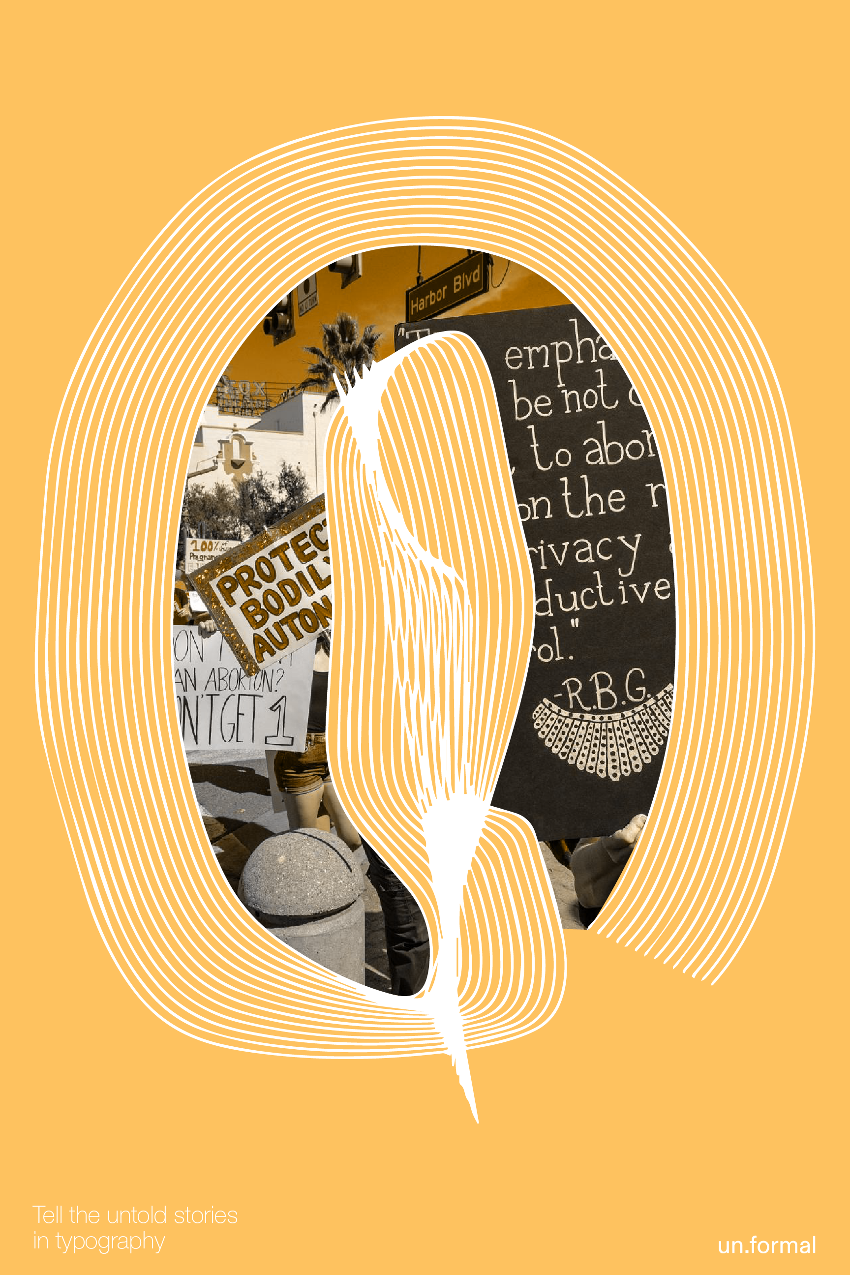
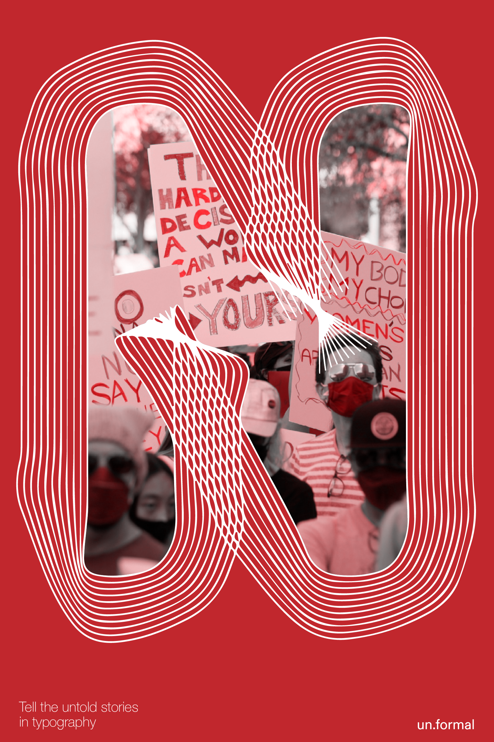
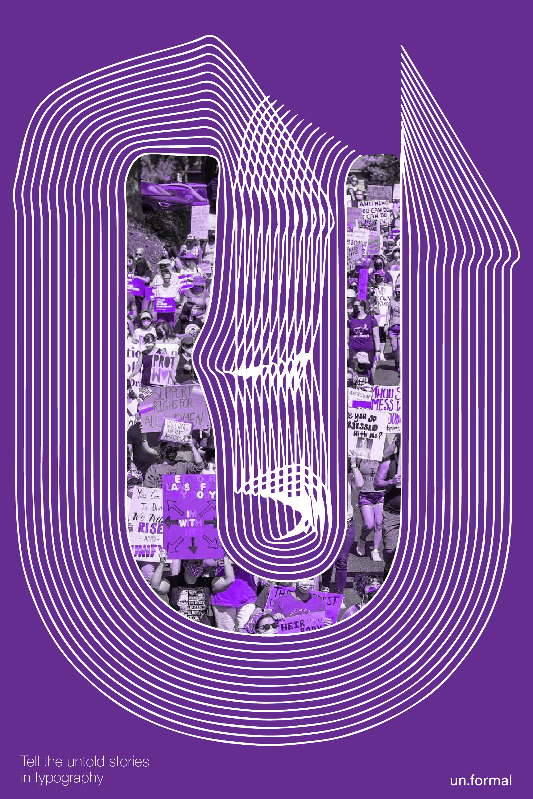
Following are serious of New Fonts Designed for Voice Control Type Tool. Those typefaces were inspired or influenced by different movement, art series, and female artists, that are either underrated or underrepresented.
I thought about whether to make “everyone can upload their own handwritten fonts”, but such legibility and aesthetic would be accordingly unpredictable. Therefore, it is necessary to control variables to a certain extent. That’s the reason we need the fonts for type tool.
Fonts specially designed for online creative code type tool.
Following are serious of New Fonts Designed for Voice Control Type Tool. Those typefaces were inspired or influenced by different movement, art series, and female artists, that are either underrated or underrepresented.
I thought about whether to make “everyone can upload their own handwritten fonts”, but such legibility and aesthetic would be accordingly unpredictable. Therefore, it is necessary to control variables to a certain extent. That’s the reason we need the fonts for type tool.
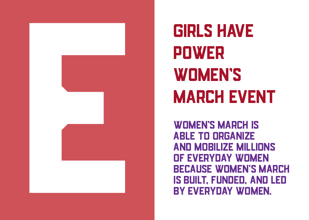
The first typeface, Evelynus, was inspired by the signages in Women’s March Movement recently. People are using handwritten sign in the movement to show their emotions. And I want to use typography to capture their emotions.
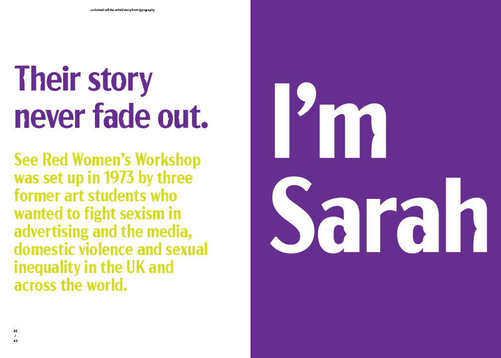
Sarah is the typeface inspired by the See Red Workshop, follow the name of one of the founder.
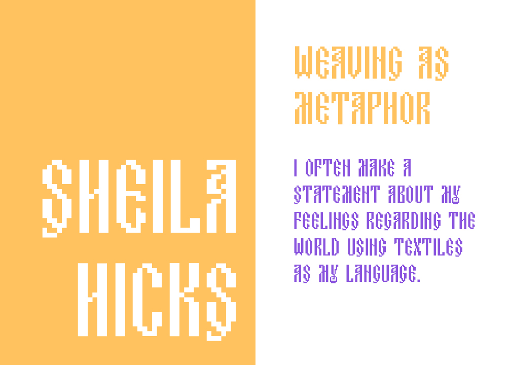
Sheila Hicks once mused, “I often make a statement about my feelings regarding the world using textiles as my language.” Sheila Hicks: Material Voices honors her unique vision, examining how her visual language has been shaped by memory, place, and space. Drawing on global weaving traditions, the history of painting and sculpture, graphic design, and architecture, among her many sources, Hicks has redefined the role of fiber and thread in art. From monumental architectural interventions to her miniature weavings known as minimes, Hicks’s compositions combine an aptitude for color, line, and texture with her inimitable understanding of architectural space.
To better understand Hick’s work, I try to use modular type system to mimec her textile style in font design.

This flexible unicase font was inspired by the National Museum of Women in the Arts. Female artists are underrated and underrepresented in many ways. The museum is a very important way to promote the exhibition installation as well.